Fonts are more than just letters on a page. They help tell a story, build emotion, and create a unique feeling in design. Aesthetic typefaces, in particular, have become very popular in modern visual projects. From social media posts to logos, these typefaces give designs a soft, stylish, or even dreamy look. They make words stand out while still being easy to read. If you want to explore different styles, you can use an aesthetic font generator to try out beautiful fonts instantly.
Using aesthetic letterings can help a designer share a mood or message without needing many words. These fonts are often seen in handmade crafts, branding for skincare or clothing, and even mobile app designs. When chosen well, they become a key part of how the whole design feels. But it’s not just about being pretty — it’s about balance. A great typeface should fit the project, connect with the audience, and be readable.
Making Fonts Speak in Design
Fonts are more than decoration. They can speak, even without a voice. Think of a soft script typeface — it can feel calm, romantic, or even artistic. A bold serif font, on the other hand, might seem strong, elegant, or serious. Designers choose fonts not just for beauty, but to guide emotions and tone.
This is especially true in projects where the look and feel are very important. For example, in icon design, we often work with tiny details. Letterings need to match that same care and attention. If you are creating icons for a spa app, using a gentle, flowing typeface creates harmony. A blocky or harsh font would break the calm feeling.
As Aida González Vázquez once said,
“Typography is the voice of your design; choose a font that speaks with the right tone and clarity, ensuring that every letter not only looks beautiful but also communicates effectively.”
This quote reminds us that beauty and meaning must go together. Aesthetic fonts help us do that — they are the voice behind the visuals.
A font must also match its space. In icon sets, where space is small, too much detail in a typeface can make it hard to read. Choosing a clean aesthetic font ensures the look stays sharp and soft, even at small sizes. This same idea works for web design, posters, or even physical packaging.
Where Aesthetic Fonts Work Perfectly
You might wonder where you should use aesthetic fonts. The truth is — almost anywhere, if used with care. These typefaces work well when your design needs a light, elegant, or creative feeling. They often appear in:
- Social media graphics (like Instagram posts or YouTube thumbnails)
- Brand logos for lifestyle or fashion brands
- Invitations, posters, or greeting cards
- Website headers or mobile app splash screens
In these places, the look is just as important as the words. For example, an invitation to a baby shower might use a rounded, handwritten font. A logo for a handmade candle brand could use a thin, serif aesthetic typeface to feel warm and personal.
Designers must always check contrast and clarity. A beautiful typeface won’t help if people can’t read it. That’s why it’s smart to mix letterings. Pair a soft, aesthetic font for titles with a simpler one for body text. This helps the design feel stylish but still clear.
Also, try fonts in real situations. Put them over images or try different sizes. An aesthetic typeface that looks good in a tool might look too thin on a printed flyer. Testing helps you see how the font truly performs.
Tips for Choosing the Right Aesthetic Font
Choosing a font can be exciting — but it’s also tricky. Aesthetic fonts are often full of personality, so it’s easy to pick something too flashy or too soft. Here are a few tips to help:
First, think about your project’s message. Is it playful, elegant, or romantic? The typeface should match that feeling. Second, think about who will see the design. If the audience is young and modern, maybe a handwritten or quirky font is best. For a more classic crowd, something clean and gentle works better.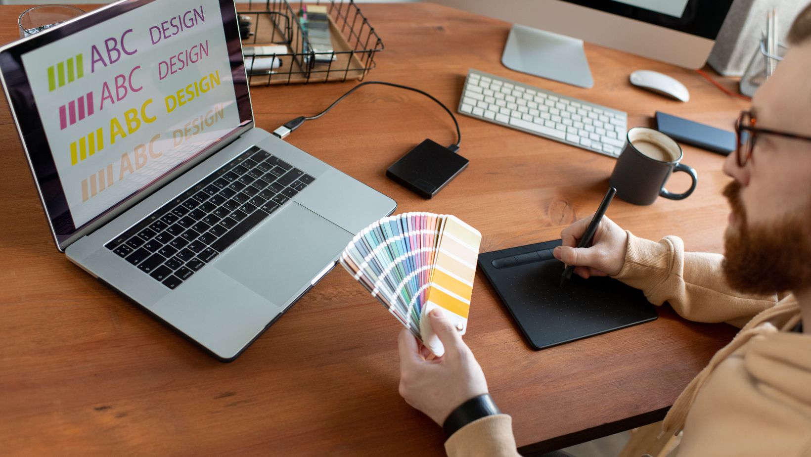
Next, check the font in context. Type a real sentence or title — not just “ABC” — to see how the letters work together. Look at spacing and shapes. A beautiful letter might not look great in a full sentence.
Also, check the file quality. Some aesthetic letterings are free, but they might not be well-made. Always try to use fonts from trusted sites or generators. They usually have good spacing and support many languages or symbols.
Finally, ask yourself: will this typeface still look good in six months? Some fonts are trendy, but not timeless. Pick one that fits the design now, but also holds up later. This is important for logos or product packaging that lasts longer.
Designing with Purpose and Personality
Aesthetic fonts help designers bring style into everyday projects. But more than that, they help add feeling, softness, or even mystery to a design. This is powerful. In the world of icons, typefaces can carry meaning in a small space. A rounded font can feel friendly, while a thin serif adds class.
Good font choices also help connect design pieces. If you’re making a set of app icons and they match the font style, the whole project feels more polished. Everything works together. Typefaces are not just tools — they are design elements that work with color, shape, and texture.
Design is about communication. A font can whisper, shout, or sing — it depends on what you need. But no matter the project, aesthetic typefaces offer a way to add emotion and personality, without saying too much.
Remember: keep it clear, keep it simple, and keep the font in tune with your message. When all of these come together, even one word can become a work of art.